I'm Kristen Victoria, aka "KV," and I blog over at KV's Confessions. My slice of the internet started out as a place to document and share my experiences as I attended graphic design school. Almost two years and an Associate's Degree later, I'm still sharing my love of design, inspiration, life lessons and dreams, with bits of fashion, humor, and lots of confessions- mostly with sarcastic commentary ;)
But enough with the intros... I didn't come here to talk about me! I'm here today and honored to host Emily's weekly Wedding Wednesday! Today's theme?
Typographic Wedding Invitations
I've been married six years, so why are wedding invitations on my mind?
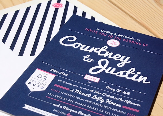
I recently had the pleasure of designing my best friend's -- a big task, to say the least -- and typography choices were a huge part of the design process.
Here were the results in all their printed glory:
 |
Invitation Pocket Holders: Paper & More, Belly Band Ribbon, Photo Corners: Michael's Craft Stores
Cardstock and Vellum Overlay: Xpedx, Printing: FedEx Kinko's
|
Needless to say, I was thrilled to be of service and help with delivering the first impression of her big day. I was even more excited to play around with fonts -- it's kind of my favorite thing to do. :)
It's definitely wedding season and I've seen my fair share of invitations lately. My eye is always drawn to the typography-themed designs. They don't typically include engagement photos, so to successfully pull off showing a couple's personality and wedding theme, it needs to be really well-designed and pristinely printed.
Here are a few typography designs that have made my designer heart melt...
 |
| image source: Minted, designed by Jennifer Wick |
 |
| image source: Minted, designed by Potts Design |
 |
| image source: 100 Layer Cake |
 |
| image source: Impress Ink |
 |
| image source: Minted, designed by Stacey Day |
 |
| image source: Bow Arrow Paper Co. |
 |
| image source: Jen Simpson Design |
Now, I know some brides might be hesitant to withhold photos in the invitations (doesn't everyone see those on Facebook, anyway?), but I would suggest at least considering a simplistic and typography driven design. From a designer's point of view- it's elegant, modern, and oh so memorable! Everyone will be drooling and wondering how you pulled off such a standout introduction to your big day.
* * * * *
I hope I got your wedding inspiration wheels turning,
and also hope you come visit me to say hello!


Kristen's design is absolutely beautiful! I was wondering, how do you decide where to print it? With so much work going into design, I'm sure you want to make sure it's printed just as beautifully! Such beautiful inspiration, lovely post.
ReplyDeleteEvani
Kristen did such an awesome job on these, and the other examples she shared are so great! I love fonts too, and love to look at how designers use them. :) Thanks for sharing such a great post!
ReplyDeleteBeautiful choices! I have to sat, I pulled out all the stops with invitations. They really had to be beautiful and unique, so I splurged a little. It was a good decision! I love the fact that invitation design has become more modern and colorful over the years.
ReplyDeleteKristen is SO TALENTED! thanks for featuring her :)
ReplyDeleteTotally love Kristen's design. I've just done my own invitations, to be printed this weekend, but they're nowhere near this fancy! =)
ReplyDeleteholy pyjamas these are amazing!!!
ReplyDelete